Sunday, 4 November 2012
Donald's Crime
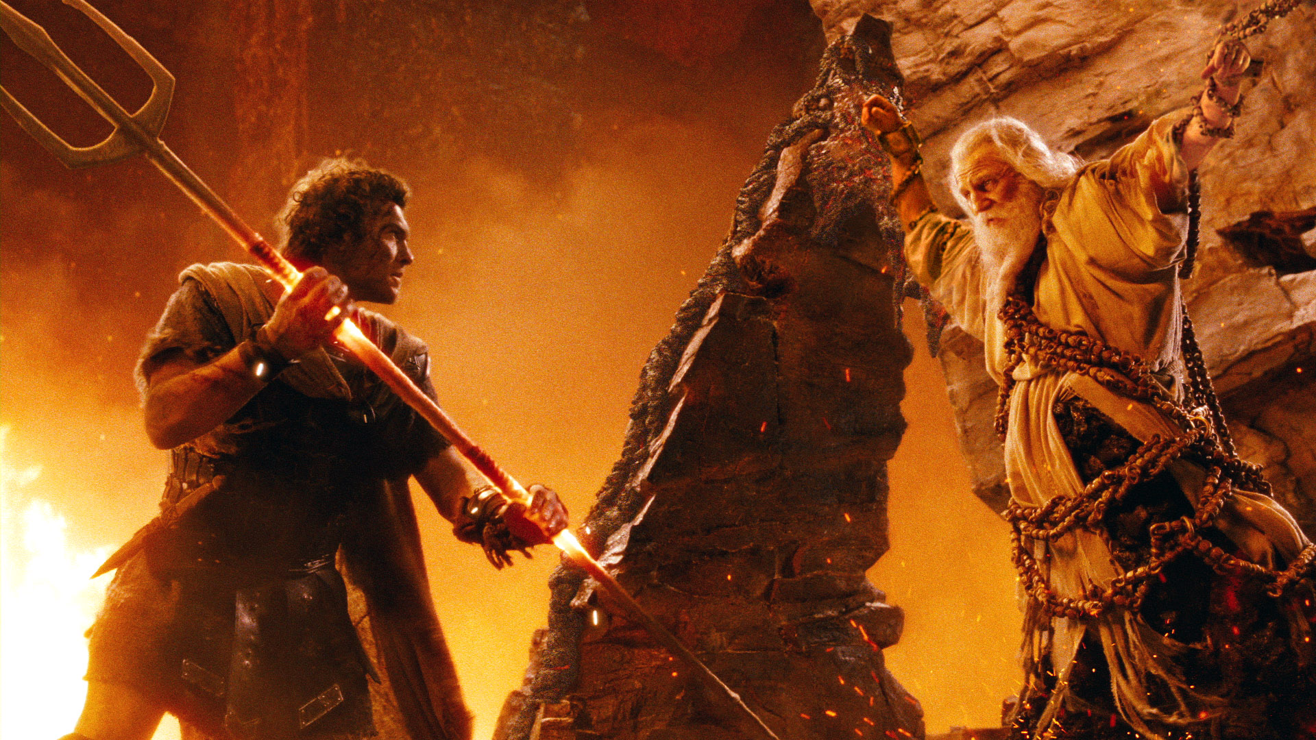
The use of colour in this image is really interesting; the way the orange melds into the contrasting hue of blue and also the use of tone to create shadows and depth to the image.
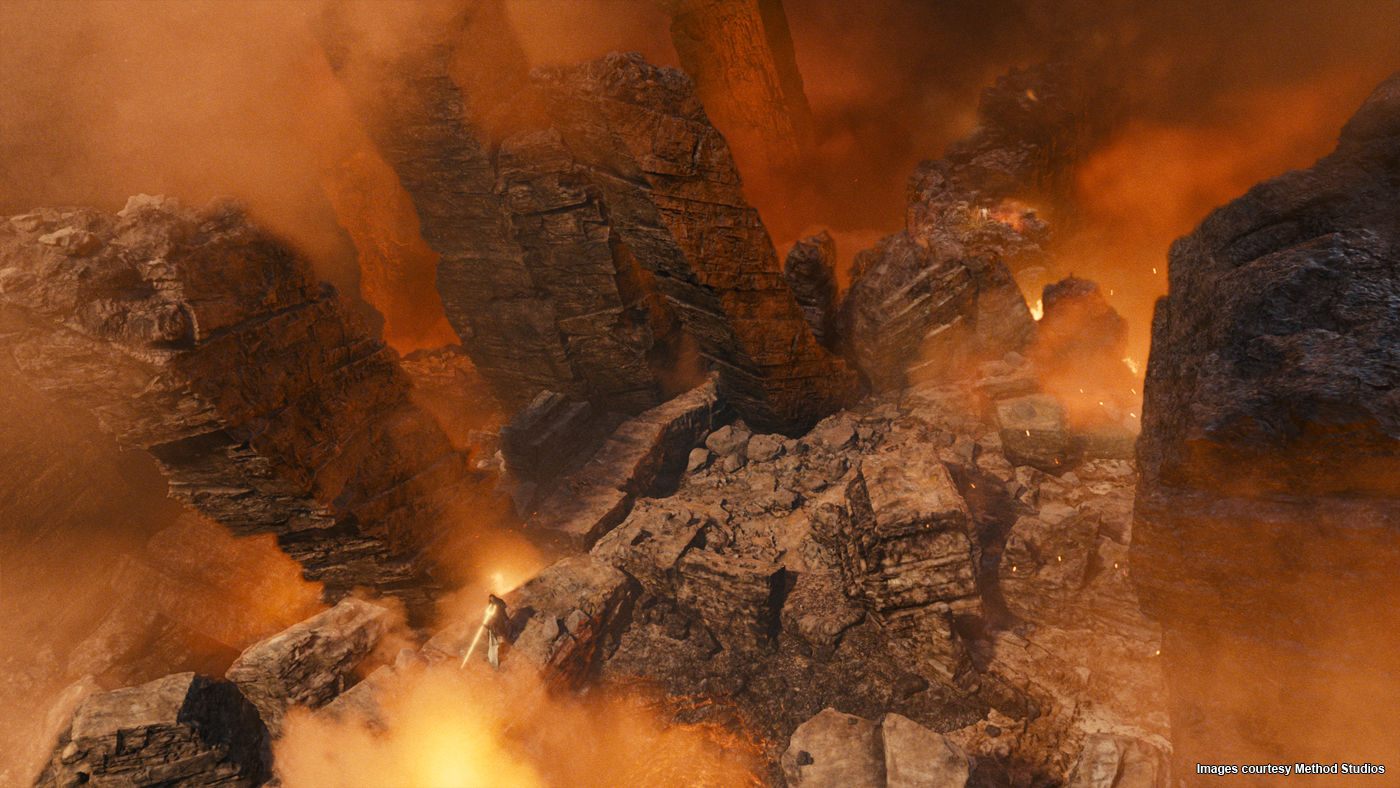
Some more interesting background images created by Hans Bacher from Donald's Crime
"The Cold Heart" colour script
![]() |
| Daz Kalte Herz (The Cold Heart) colour script |
In this colour script there are a variety of different colour scheme sets, some scenes consist entirely of one hue whilst there is also one that has only contrasting colours.
"Grandfather's Ship" colour script
![]() |
| "Grandfather's Ship" colour script |
This is a quite simplistic colour script with no definitive shape to scene composition etc but is very expressive and clearly represents the mood and feel of the scenes. I also like the layout of this script which seems to insinuate the progression of the story more.
"UP" Colour Script
![]() |
| "Up" colour Script |
This is the colour script from the Pixar animated movie "UP". It is interesting to see quite a large contrast between some of the colour schemes which enhance the overall mood of those scenes, the happier scenes containing vivid and warm hues with high saturation where as the bleaker more emotionally negative scenes contain mainly blues and heavily de-saturated hues.
Colour Phenomena
After reading the article "Phenomenal Illusions" on the "Phenomenal Qualities" blog I became to understand more about the importance and impact of a colours surroundings and not just the focus of the base colour and the way it can alter colours in the same composition.
Michel Eugene Chevreul whilst working at Gobelins Manufactory as the "Dye Directer". In his study "The Principles of Harmony and Contrast of Colours" he goes on to talk about other phenomena such as Successive Contrast or Negative Afterimages. This is when "...two colour areas are seen close together in space or time, each will shift in hue and value as if the visual complementary colour of the neighboring or preceding colour were mixed with it."
This is to say when you view one hue then view a second different hue you perceive the colours mixed.
Phenomenal Illusions: http://phenomenalqualities.wordpress.com/phenomenal-pictures/
The Principles of Harmony and Contrast of Colours by Michel Eugene Chevreul: http://www.handprint.com/HP/WCL/chevreul.html
| Square A and B are actually the same Hue, this is altered by the adjacent squares. (Deconstruction of the image below) Deconstruction of the illusion |
Michel Eugene Chevreul whilst working at Gobelins Manufactory as the "Dye Directer". In his study "The Principles of Harmony and Contrast of Colours" he goes on to talk about other phenomena such as Successive Contrast or Negative Afterimages. This is when "...two colour areas are seen close together in space or time, each will shift in hue and value as if the visual complementary colour of the neighboring or preceding colour were mixed with it."
This is to say when you view one hue then view a second different hue you perceive the colours mixed.
Phenomenal Illusions: http://phenomenalqualities.wordpress.com/phenomenal-pictures/
The Principles of Harmony and Contrast of Colours by Michel Eugene Chevreul: http://www.handprint.com/HP/WCL/chevreul.html
Colour Proportion and its effects
It was already apparent the importance of hue, saturation, value etc when creating a colour scheme but the proportion and relation of a colour in a composition also influences heavily the type of mood and impact the image has.
A way of explaining and experimenting with the effectiveness of colour proportion is to use a colour palette in the way of having a Dominant, Sub-Dominant and Accent Colour(s). The largest area being the dominant colour and the smallest being the accent colour, usually a contrasting colour, differing in hue, intensity or saturation.
Depending on the choice of dominant color, the feeling of the composition, and even the appearance of each color, is altered.
Proportion & Intensity: http://www.worqx.com/color/color_proportion.htm
Tuesday, 30 October 2012
Using Saturation for effect
Some really cool concept art by Jannis Borgers using saturation to create depth in his images.
Using saturation in the creation of artwork.
This is an example by Xia Taptara of using colour saturation as a colour overlay to quickly and easily establish a colour scheme for her piece.
The image is from a tutorial for Photoshop I found interesting:
http://idrawgirls.com/tutorials/2011/10/31/photoshop-tutorial-overlay-mode-part-2/
Saturation/Intensity/Purity
Saturation (or Intensity) refers to the colourfulness of a colour relative to its own brightness, a "pure hue" is achieved when a colour is not mixed with either black and white or grey. It is the intensity of a hue from grey, a highly saturated colour would contain little or no grey at all whereas a highly de-saturated colour would be mostly grey.
Friday, 26 October 2012
Value in artwork
In the water colour painting below, Cady Driver uses colour value to represent depth in her landscape. Lighter hues are used for distant objects whereas more prominent objects are dominated by darker shades.
Below are the colour value exploration variants for "Squonk's Hideout" by Mike Ocasio.
Cady Driver's Website: http://www.artbycady.com/index.html
Mike Ocasio's Blog: http://mikeocasio.blogspot.co.uk/
Value in film
I found it interesting looking at black and white movies for value examples. This image from Dracula (1931) creates a dynamic contrast of values adding to the demonic nature of the character.
In this image from The Artist (2011), there is a larger variety of shades and highlights creating some interesting gradients and also highly contrasting ares of the actors clothing.
Colour Expression: Wrath of the Titans
Colour expression is used in this scene of Wrath of the Titans (2012) to convey aggression and heat, the hue intensifying in areas of extreme heat.
Colour Value and its uses
Value; the lightness (tint) or darkness (shade) of a colour. i.e. Navy is a dark value of Blue, whereas Cyan is a light value.
When producing artwork, value is used in many different ways such as representing the effect of light on an object (highlights or shadows), this helps create the illusion depth by using gradients. Value can also be used in a contrasting method to create emphasis in a piece; a dark figure in a light environment or like-wise a light figure in a dark environment.
Friday, 5 October 2012
Colour in Motion
Colour in Motion by Claudia Cortes
"An interactive Experience of Colour Communication and Colour Symbolism"
Claudia Cortes's Colour in Motion is and interactive movie containing a collection of shorts exploring the nature and meaning of colour.
Colour Expression
Colour is a very powerful tool when expressing emotion in a piece if work. The interpretation of colour and its corresponding emotion is done partly through natural responses but is also governed by taught ideas. Commonly in the current age colours have a predicted emotive paring, red meaning angry, yellow meaning happy etc. The relation between emotion and colour has been assessed multiple times leading to the idea of colours not representing a single emotion but also having negative and positive traits.
The first to categorize colour in such a way was Johann Wolfgang von Goethe in his work “Color Theory” (Zur Farbenlehre 1808-1810), which present a slightly different perspective of colour meaning then what we know of today.
Claudia Cortes is another that has investigated the meaning of colour in a similar way.
Shirlet Willett's interpretation outer ring containing positive traits, middle represents emotion and inner ring are negative traits.
The first to categorize colour in such a way was Johann Wolfgang von Goethe in his work “Color Theory” (Zur Farbenlehre 1808-1810), which present a slightly different perspective of colour meaning then what we know of today.
Shirlet Willett's interpretation outer ring containing positive traits, middle represents emotion and inner ring are negative traits.
![]() |
| outer ring containing positive traits, middle represents emotion and inner ring are negative traits. |
Basic colour concepts and Colour schemes
Colour is used in many different ways; to set a ambiance, invoke emotion, draw attention or for symbolic reasons. A correct colour palette can hugely impact the message you wish to portray and can bring deeper meaning to your works of art.
There are a variety of colour combinations that can be used to enhance your desired theme such as Harmonious colours. There are several different types of harmonious colour sets including;
All colours on the colour wheel can be split into two groups, warm and cool colours. This also plays an important part when deciding on a colour scheme. Warm colours create a vibrant, energetic atmosphere whereas cool colours are calm and relaxing.
- Complementary colours (opposing colours on the colour wheel to create an energetic outcome)
- Analogous colors (three colours next to each other in the colour wheel that create a pleasant viewing experience and is usually found in nature.)
- Triadic colours (colours evenly spaced on the colour wheel in a triangle shape this also creates a fairly energetic mood)
All colours on the colour wheel can be split into two groups, warm and cool colours. This also plays an important part when deciding on a colour scheme. Warm colours create a vibrant, energetic atmosphere whereas cool colours are calm and relaxing.
![]() |
| Basic colour wheel displaying primary colours |
Subscribe to:
Posts (Atom)


